Jaunty Father’s Day Card

jaunty father's day card

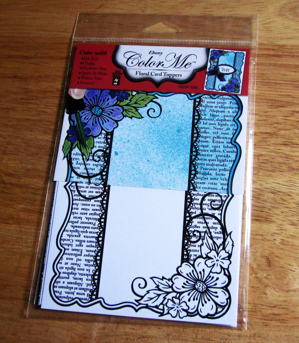
Masculine cards are always a challenge to make. Most of the papercrafting supplies available are more suited to feminine or children’s projects. There are more and more manufacturers who have heard our cry for masculine papers and materials, and are answering the call. This is a fun Father’s Day card that I created from the second half of the Ebony Floral Color Me Card Topper from Hot Off the Press.  As I previously mentioned in some of my blogs, I belong to a Dazzles Personal Shopper subscription program and I receive some stickers that are not generally available for individual sale.  The May 2015 kit included a brown version of the Rad Dad Dazzles (only for sale in black).  These Dazzles are a lot of fun; they are loaded with many different sized mustaches and glasses, a couple of hats, and other fun things including words such as: hipstar, rad, original, etc. You should take a look at the link that I have posted at the bottom of the page.

coloring with crayons and babywipes

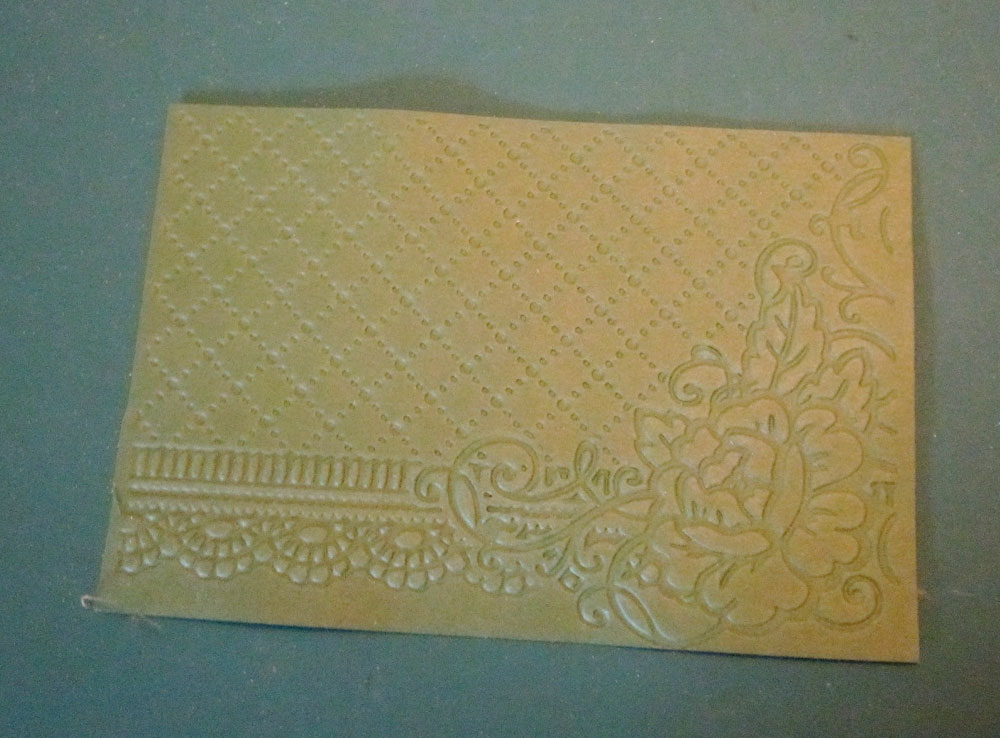
I dug out some plain chocolate brown, cream tone-on-tone and some black paper with white dots from my stash for the card. I covered the front of an ivory 6 ½ x 5 inch card blank with the black and white paper. I put the text half of the color me paper along the top right edge, leaving a slim margin.  I then cut a 3 x 5 inch rectangle of cream tone-on-tone paper, rounded the corners, inked the edges with brown ink and matted it on the chocolate brown paper with a 1/8 inch border. I then inked the edges of the brown paper with black ink and layered the paper on top of the color me topper.  I chose the biggest mustache, glasses and hat from the brown Rad Dad Dazzles, and placed them on the cream paper, placing the hat at a “jaunty” angle. I then found a piece of ribbon from my stash that I thought would make a nice bow tie (tan gingham) and glued it below the mustache.

One of the great extras that Hot Off the Press/Paper Wishes does is to give you a free download for their paper packs. This is usually some labels and extra art. I had purchased a Chocolate Paper pack several years ago (thinking it would be good for masculine cards) and downloaded the page of tags and labels.  I computer journaled “Happy Father’s Day” on a label that worked perfectly for this project and placed it on the lower right corner of the card front. Unfortunately, the Chocolate paper pack and download are no longer available, but Paper Wishes does have other paper packs that would work well for masculine cards.

Supplies

Check out other paper and items at www.paperwishes.com.

Thank you for visiting my blog. I will be working on some more multi media techniques soon.

Aloha Card

If you have been following my blog, I am in the beginning stages of trying different mixed media techniques. This is a card that I made from using Hot Off the Press’s Color Me Card Toppers. These papers are on glossy cardstock and have a raised, embossed image and come in all kinds of colors of the embossing: white, black, silver, brown, and copper. They are also available in 12 x 12 sheets. The beauty of using these papers is that you can color them whatever color you want, so you will always have that “perfect” color of paper.  Here is a link to a “Webisode” tutorial for using the Ebony Floral Color Me toppers: http://www.paperwishes.com/webisodes/?id=424.

aloha card

I chose one of the sheets that had a floral side and a “text” side, and cut the card in half.  I will be showing a project I made with the text edge in a couple of days. Today’s project is using the floral edge. I used Stampin’ Up “Watercolor Pencils” from a set I got in the early 2000s.  They are really crayons, not pencils. I believe that the watercolor pencils that they sell now are actual pencils.  I picked some pink and orange colors for the flowers and the end result was tropical in look. I used a light aqua alcohol pen for the background and and colored the flowers and leaves with the crayons. The technique I used was to scribble the crayons on the shiny side of freezer paper and use a wet brush to pick up the color.

aloha card inside

I went through my stash of cardstock and found a perfect pink and I cut the cardstock to make a 5 x 6 inch card. I fished through my papers and found some coordinating pink patterned paper.  I belong to Paper Wishes Premiere Dazzles Personal Shopper subscription service, and I had received some red Hibiscus Dazzles stickers a couple of months ago. There is an “Aloha” sticker in the set, which I thought was perfect for this card. I placed the “Aloha” on light pink paper and matted it with the leftover pink cardstock. I also used a red jewel border Dazzle sticker along the right edge of the card, and I had some red tiny flower Dazzles that were a perfect match and I placed them on the edge

For the inside, I cut two 2 ½ x 3 ½ inch rectangles and placed the darker pink print paper slightly offset behind the lighter pink paper. I chose a “Just Because” tiny gold Dazzles sticker, and added some more red flower Dazzles.  This is a nice bright, summery card to send to anyone.

Materials Used: 

Your choice of coloring media

All these items can be purchased from www.paperwishes.com

Link to previous blog posting: https://prettycolorful.wordpress.com/2015/05/25/beginning-with-mixed-media/

Beginning with mixed media

I dove in and started my first techniques with mixed media. I started out with a set of Color Me card toppers from Hot Off the Press (they were on sale). I decided that I would use a different media for coloring toppers from this set.

hotp color me toppers

Using Fluid Chalk Ink Pads

Colors: Fawn, Splash, Concord, Harvest, and Pink Sky

I am frugal with my craft tools, and I use either freezer paper or parchment paper for my craft sheet. Freezer paper has a plastic coated “shiny” side that works well with using water coloring techniques. I also used an acrylic stamp block, cosmetic sponge and brushes. I used a cosmetic sponge with the Fawn ink pad to color the outside text area of the color me topper. I pounced the ink pads a couple of times on the acrylic block and with a wet brush picked up the color and painted the flowers. Since I didn’t have a green inkpad, I mixed some of the Splash and Harvest together to create an olive green color for the leaves. I used a cosmetic sponge to pick up the aqua “Splash” for the central area and brushed it across. I accidently got one edge of the topper a little damp, so you can see the paper curled up a little.

topper colored with chalk ink

Stampin‘ Up Watercolor Pencils (from  over 10 years ago, they are actually crayons) and baby wipes.

I have had these crayons in my stash for years and have never really used them much.  I think you get actual pencils now from Stampin’ Up. I have been curious about using Gelato sticks, and found out that the techniques that are described for using Gelatos work with these crayons.

color me topper halvesI cut one topper in half; and used different coloring techniques on each half.  I used a brown watercolor crayon and roughly colored the border of the text half of the topper.  I  then used a baby wipe to blend the edges of the topper, and then colored the center with the color on the baby wipe.  I have seen this technique used with Gelatos on some craft videos.

For the floral half, I used a light aqua alcohol pen to color in the text area.  I then scribbled various tropical pink and orange colors on my freezer paper and used a wet paintbrush to color the flowers and leaves.

Alcohol Pens

I used red, yellow green and light aqua alcohol pens to color the final topper image.  As you can see, I’m learning how to use my alcohol pens. I still have to learn blending techniques.

color me alcohol

I’m going to make a couple of cards from some of the toppers.  I’m planning on working on them in the next couple of days.

Embossing and Inking

I am continuing my journey with embossing folders by showing some examples of paper types and inking. In my previous blog I discussed how I used Hot Off the Press’s Rose Corner embossing folder on different types of paper; I am using some of the cardstock for inking techniques. After you emboss some paper or cardstock, you can swipe an ink pad lightly over the surface, or do what I did and use a cosmetic wedge. You get a little more control over the amount of ink you use. I used Clear Snap’s Fluid Chalk Inks for this purpose because the ink pads are nice and juicy and the ink works well on most surfaces.

ef_inked

This example is using Splash Fluid Chalk ink on ivory cardstock. Just lightly press the cosmetic wedge onto the ink pad and gently swipe across the surface.  You can vary the amount of color picked up on the embossed surface.

The second example is with parchment paper and I used Concord Fluid Chalk Ink on this piece of parchment.

letterpress

For this example, I did a different technique. I inked the front of the embossing folder with Fawn Fluid Chalk Ink and put a light blue piece of cardstock in the folder and ran it through the die-cutting machine. If you look closely at the edge of the paper, you can see the differences between the inked surface and the original surface. This embossing folder is a little more intricate, you would get more of a letter press look if you had a simpler embossed design. What I ended up with was to change the color of the cardstock to a greenish-gray color.

ef_debossMy last example is similar to the previous one, except I used Versamark ink on the bottom of the folder and ran a wine-colored piece of cardstock through the machine.  I then sprinkled white embossing powder on the debossed side where the Versamark ink was and heat embossed it.  I got a distressed-looking image which might work very nicely for a background.

The inks I used for this project should be available at most craft stores:

Versamark Ink Pad

Clear Snap’s Fluid chalk inks in: Splash, Concord and Fawn

Thank you for visiting!

Emboss This!

I have set a goal for myself for this summer. I have been interested in mixed media, and I am planning on working on several techniques. I have a final project in mind, but I will reveal the project after I have had the opportunity to try a few new techniques.  I will be doing a series of blogs showing all the new techniques that I will be learning.

Although technically embossing folders are not mixed media, I will be including some embossed pieces in my final project. I looked through a lot of different embossing folders, including those I have in my stash, and decided on Hot Off the Press’s Rose Corner embossing folder. This folder will work beautifully with the papers that I have selected for my project.

You need to follow the directions for your specific machine when you use an embossing folder.  I have a Sizzix BigKick and it comes with a multi-purpose platform with instructions on which tabs to use for each process.  I did have to make adjustments for the thicker papers.

Embossed and debossed paper

You can do a lot more with an embossing folder than just running it through your die-cutting machine.  I used a few different techniques on different kinds of paper to see the effects. The only paper that I did use was patterned paper because I was not sure how well the embossing would show up in photographs. I used the following cardstocks and paper:  80 lb cardstock in various colors; 60 lb cardstock with a textured finish; 350 gsm Hunkydory Adorable Scorable cardstock; parchment paper;  Hot Off the Press’s holographic and foiled papers (they are heavyweight, more like cardstock). I would like to point out a couple of tips for embossing heavyweight papers and cardstock: lightly spritz the back of the paper with water, it helps break down the fibers and the embossing works much better. I was not sure how well the Hunkydory Adorable Scorable cardstock would do, but the coating on that cardstock left a gorgeous finish, the embossing looks polished.  There were no cracks.

debossed

The first technique I used was to just use the embossing folder with a variety of cardstock.  You can choose to use the embossed or debossed side of the paper.  When I embossed the parchment paper, I put a piece of 60 lb cardstock behind the parchment paper to reduce the cracks. There were still a few little cracks, but they just add a little personality.

The next technique was to sand the holographic and foiled papers. The foiled paper is teal and has a tone-on-tone print. The color in the photograph is a lot lighter than the actual paper.  I used a sanding block to lightly sand the embossed sections to reveal a white core. I did the same thing with the brown holographic paper. The embossing really shows up and both papers are very shiny.

sanded

I will continue my embossing techniques in another blog because I took a lot of photos and I don’t want to make the blog too cluttered with photos.  I will end with photos of two cards I made from the embossed pieces: a card using the embossed piece of Adorable Scorable and the debossed side of green cardstock.

References:

http://www.paperwishes.com/products/4106009

http://www.paperwishes.com/webisodes/?id=589

adorable scorable card

debossed card